-
Name two tourist attractions found in Kenya Rift Valley of Kenya.
(Solved)
Name two tourist attractions found in Kenya Rift Valley of Kenya.
Date posted:
May 27, 2019
.
Answers (1)
-
What is a population pyramid?
(Solved)
What is a population pyramid?
Date posted:
May 27, 2019
.
Answers (1)
-
Students from Kar School intends to conduct a field study on land forms around their school.(i) State two objectives of their study.(ii) What is the...
(Solved)
Students from Kar School intends to conduct a field study on land forms around their school.
(i) State two objectives of their study.
(ii) What is the importance of a reconnaissance trip to the students?
(iii) List any two methods they would use to present their data.
Date posted:
May 27, 2019
.
Answers (1)
-
State two characteristics of the troposphere.
(Solved)
State two characteristics of the troposphere.
Date posted:
May 27, 2019
.
Answers (1)
-
The diagram below shows the internal structure of the earth.
Use it to answer the question below.
Name the parts marked X and Y.
(Solved)
The diagram below shows the internal structure of the earth.
Use it to answer the question below.
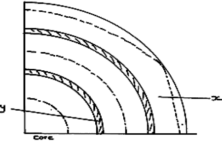
Name the parts marked X and Y.
Date posted:
May 27, 2019
.
Answers (1)
-
Student of Gakoye high school carried out a study in a local forest .What problem are they likely to experience
(Solved)
Student of Gakoye high school carried out a study in a local forest .What problem are they likely to experience
Date posted:
May 27, 2019
.
Answers (1)
-
Name two main pests that affect sugarcane crop
(Solved)
Name two main pests that affect sugarcane crop
Date posted:
May 27, 2019
.
Answers (1)
-
Define the term Invisible trade.
(Solved)
Define the term Invisible trade.
Date posted:
May 27, 2019
.
Answers (1)
-
Supposing you were to carry out a field study on the Rift Valley.
(i) State any two objectives of the study.
(ii) State three importance of studying...
(Solved)
Supposing you were to carry out a field study on the Rift Valley.
(i) State any two objectives of the study.
(ii) State three importance of studying faulting through field work.
Date posted:
May 27, 2019
.
Answers (1)
-
Define the term drainage basin.
(Solved)
Define the term drainage basin.
Date posted:
May 27, 2019
.
Answers (1)
-
State the effect of crossing the international dateline from West to East.
(Solved)
State the effect of crossing the international dateline from West to East.
Date posted:
May 27, 2019
.
Answers (1)
-
Name four horticulture farms in Kenya.
(Solved)
Name four horticulture farms in Kenya.
Date posted:
May 27, 2019
.
Answers (1)
-
What is sedentary farming?
(Solved)
What is sedentary farming?
Date posted:
May 27, 2019
.
Answers (1)
-
Calculate the population density for Kiambu County, given that its area is 2543.4 square kilometers.
(Solved)
Calculate the population density for Kiambu County, given that its area is 2543.4 square kilometers.
Date posted:
May 27, 2019
.
Answers (1)
-
Six challenges facing industrial sector in Africa
(Solved)
Six challenges facing industrial sector in Africa
Date posted:
May 26, 2019
.
Answers (1)
-
Describe the Processes in Which Circulation Is Carried Out in a Hydrological Cycle
(Solved)
Describe the Processes in Which Circulation Is Carried Out in a Hydrological Cycle.
Date posted:
May 4, 2019
.
Answers (1)
-
Give the negative effects of Hydrological cycle
(Solved)
Give the negative effects of Hydrological cycle.
Date posted:
May 4, 2019
.
Answers (1)
-
State the positive effects of Hydrological Cycle.
(Solved)
State the positive effects of Hydrological Cycle.
Date posted:
May 4, 2019
.
Answers (1)
-
Describe stream Cut Valleys and their formation.
(Solved)
Describe stream Cut Valleys and their formation.
Date posted:
May 4, 2019
.
Answers (1)
-
Describe the modes of formation of Gorges.
(Solved)
Describe the modes of formation of Gorges.
Date posted:
May 4, 2019
.
Answers (1)