-
State three problems facing sheep farming in Kenya.
(Solved)
State three problems facing sheep farming in Kenya.
Date posted:
August 15, 2019
.
Answers (1)
-
Explain the factors that have led to the increasing demand for fresh fruits and vegetables in Kenya.
(Solved)
Explain the factors that have led to the increasing demand for fresh fruits and vegetables in Kenya.
Date posted:
August 15, 2019
.
Answers (1)
-
State lessons that a Muslim can learn from Sheikh Uthman dan Fodio.
(Solved)
State lessons that a Muslim can learn from Sheikh Uthman dan Fodio.
Date posted:
August 13, 2019
.
Answers (1)
-
The graph below represents the climate of station X. Use it to answer the questions that follow.
(Solved)
The graph below represents the climate of station X. Use it to answer the questions that follow.
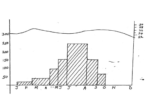
(a) Describe characteristics of the climate represented.
(b) Explain ways in which vegetation in the station adapt to the climate.
(c) Students carried out a field study on soils found on the station represented.
(i) State four soil characteristics they would look for.
(ii) Explain how they would use the following methods to collect data.
- Content analysis
- Observation
Date posted:
August 13, 2019
.
Answers (1)
-
The diagram below shows a section of the earth where an earthquake occurred.Use it to answer the question that follows.
(Solved)
The diagram below shows a section of the earth where an earthquake occurred.Use it to answer the question that follows.
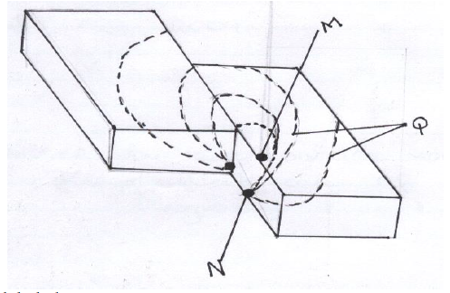
Name the parts labeled
M
N
Q
Date posted:
August 9, 2019
.
Answers (1)
-
Differentiate between a symmetrical fold and an asymmetrical fold.
(Solved)
Differentiate between a symmetrical fold and an asymmetrical fold.
Date posted:
August 9, 2019
.
Answers (1)
-
Describe the effect of a rift valley on the following:
(i) Transport
(ii) Agriculture
(Solved)
Describe the effect of a rift valley on the following:
(i) Transport
(ii) Agriculture
Date posted:
August 9, 2019
.
Answers (1)
-
Students in a school in Baringo district carried out a field study on soil erosion in the district.
(Solved)
Students in a school in Baringo district carried out a field study on soil erosion in the district.
(i) How will their findings benefit the farmers/residents of the district.
(ii) Give two methods they used to pass the information to the farmers.
Date posted:
August 9, 2019
.
Answers (1)
-
Explain four ways in which human activities contribute to soil degeneration.
(Solved)
Explain four ways in which human activities contribute to soil degeneration.
Date posted:
August 9, 2019
.
Answers (1)
-
Name two examples of Lakes in Kenya formed by tectonic movement.
(Solved)
Name two examples of Lakes in Kenya formed by tectonic movement.
Date posted:
August 9, 2019
.
Answers (1)
-
The map below shows the climatic regions of Kenya.
(Solved)
The map below shows the climatic regions of Kenya.
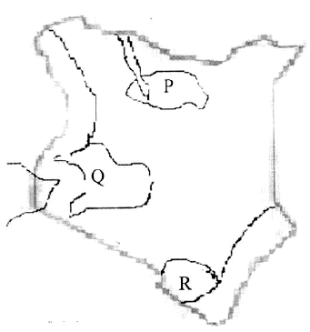
Name the parts marked Q and R.
Give four development activities that the Kenyan government could initiate
sustainably in the region marked P.
Date posted:
August 9, 2019
.
Answers (1)
-
The graph below shows climatic characteristics of a station in Kenya. Use to answer the following questions.
(Solved)
The graph below shows climatic characteristics of a station in Kenya. Use to answer the following questions.
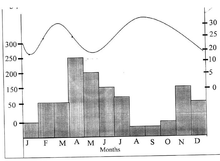
(i) Calculate the annual range of temperatures.
(ii) Calculate the annual total amount of rainfall received at the station.
Date posted:
August 9, 2019
.
Answers (1)
-
With the aid of a well labeled diagram, describe how a recumbent fold is formed.
(Solved)
With the aid of a well labeled diagram, describe how a recumbent fold is formed.
Date posted:
August 9, 2019
.
Answers (1)
-
The following map shows the location of fold mountain ranges of the world.
(Solved)
The following map shows the location of fold mountain ranges of the world.
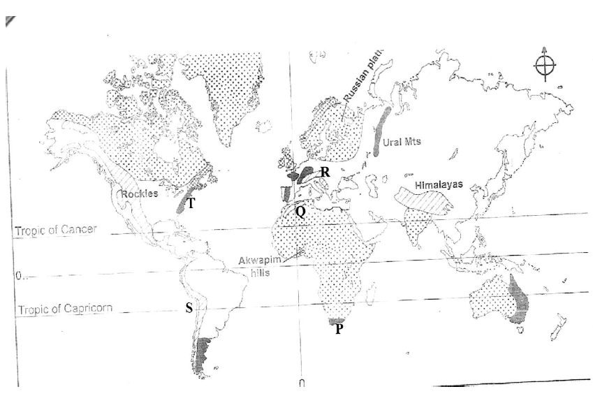
Name the features marked P, Q, R, S and T.
Date posted:
August 9, 2019
.
Answers (1)
-
Name two escarpments found within the Gregory rift system.
(Solved)
Name two escarpments found within the Gregory rift system.
Date posted:
August 9, 2019
.
Answers (1)
-
You have been asked to carry out a field study in causes of soil erosion in a region near your school.
(Solved)
You have been asked to carry out a field study in causes of soil erosion in a region near your school.
(i) Mention two methods you would use to collect data during the study.
(ii) Mention two activities you would undertake during the field study.
(iii) Mention one follow up activity you would carry out after the field study.
Date posted:
August 9, 2019
.
Answers (1)
-
Explain two negative effects of glaciations on the physical environment.
(Solved)
Explain two negative effects of glaciations on the physical environment.
Date posted:
August 9, 2019
.
Answers (1)
-
Name three methods used to estimate the age of rocks.
(Solved)
Name three methods used to estimate the age of rocks.
Date posted:
August 9, 2019
.
Answers (1)
-
Students from your school intends to carry out a field study on Lakes.
(Solved)
Students from your school intends to carry out a field study on Lakes.
(i) State two objective for their study.
(ii) Identify two methods they will use to record the data collected.
(iii) Which human activity might they have found to be affecting the Lakes?
Date posted:
August 9, 2019
.
Answers (1)
-
The table below represents rainfall and temperature of station Y.
(Solved)
The table below represents rainfall and temperature of station Y.
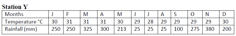
(i) Calculate the mean annual range of temperature of the station.
(ii) Calculate the annual rainfall for station Y.
(iii) Calculate the average rainfall for station Y.
(c) Describe the climatic characteristics of station Y.
Date posted:
August 9, 2019
.
Answers (1)